Matching AI Modality to User Intent: Stop Defaulting to Chat
Matching AI Modality to User Intent: Stop Defaulting to Chat
Adding AI to your product usually starts the same way: someone whacks a chatbot window into the corner of the screen. It feels like the obvious move. Open a text box, let people type, and the AI does the rest. The problem is that this "obvious" default is bleeding users. Industry surveys from 2025 show that 60% of users are frequently unhappy with chatbot interactions, and a staggering 80% say those exchanges actively increase their frustration. Matching AI modality to user intent isn't some high-theory UX exercise, it's a survival skill for any team building AI features right now. Get it right and your retention numbers, task completion rates, and error logs all move in the right direction. Get it wrong and you join the 42% of companies that abandoned most of their AI initiatives last year.
The Conversational Tunnel Vision Problem
We trick ourselves into believing that chatting with an AI is the most natural thing in the world. After all, we talk to colleagues and customers all day. But typing a coherent request into a blank text field is nothing like a real conversation. It's a high cognitive load activity that forces users to translate a visual task (like "I need to rebook this cancelled 8:15 AM flight to Miami") into precise language, all while hoping the machine understood them.
This is what I call conversational tunnel vision: the assumption that every user intent maps neatly onto a back-and-forth dialogue. The numbers say otherwise. Among popular consumer generative AI apps, average 30-day retention sits at a miserable 42%, compared with 63% for other consumer app categories. Many lose 68% of their users within the first month. When you also hear that 70% of U.S. consumers would switch brands after just one bad chatbot interaction, the pattern becomes clear. We are overusing chat. There is a better way.
The Real Cost of Mismatched Modalities
The pain shows up in hard business metrics, not just user grumbles. Mobile error clicks surged 667% between 2024 and 2025, largely driven by AI interfaces that cram too much complexity into a single chat panel. When a field technician in a noisy substation has to read a long troubleshooting bot reply on a small screen while wearing gloves, that error rate isn't a surprise. It's a design failure.
Think about the airport traveller whose flight just got cancelled. Standing at the gate, holding a carry-on, with spotty Wi-Fi, they need one thing: a confirmed seat on the next flight out. A text-based chatbot that says "I'd be happy to assist with that! Could you please provide your booking reference code first?" is adding friction, not removing it. The user has to dig through an email, squint at a six-character code, and type it without a mistake. Compare that with an interface that surfaces a "Rebook me on the 9:30 AM" button, backed by a visual timeline of options and the ability to tap to confirm. The same intent, one cruelly mismatched chat flow, and the other a zero-thought, one-tap path.
As an industry, we buried 17% of AI projects in 2024; that jumped to 42% in 2025. The biggest difference? Many of the surviving projects stopped defaulting to chat. They started asking "what is the user actually trying to do?" and picked the interface that matched that intent.
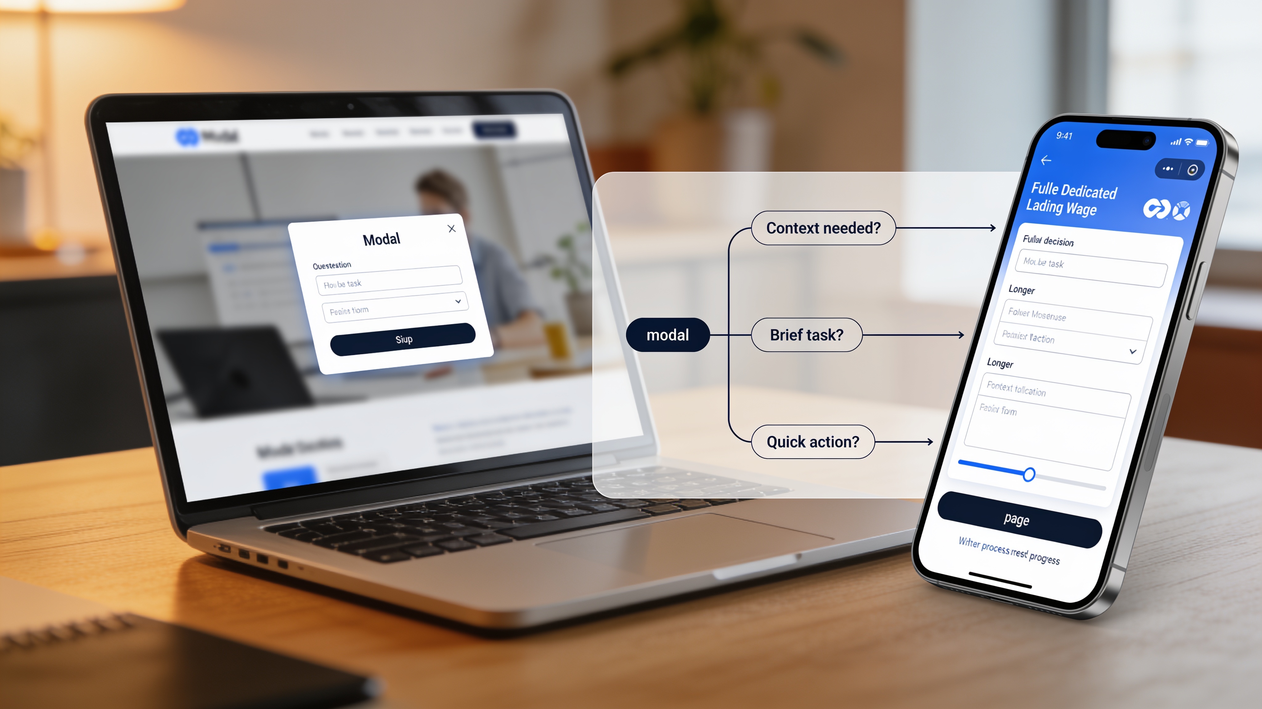
A Practical Taxonomy of Input & Output Modalities
Before we can start matching modality to intent, we need a shared vocabulary. Here are the main interface inputs you can mix and match, well beyond the chat bubble.
Input modalities:
- Button / Tap: A simple click target for a clearly defined action. Ideal for repeated, high-confidence decisions.
- Voice: Spoken commands or natural language. Perfect when hands and eyes are busy.
- Natural Language Chat: Unstructured text input in a free-form box. Best for open-ended exploration.
- Form / Wizard: A structured sequence of fields and steps. Excellent when the system needs precise, ordered data.
- GUI Controls: Filters, sliders, date pickers, drag-and-drop zones. Direct manipulation of a visual state.
- Multi-modal Input: Combine image upload with text, or a photo plus a voice note, for richer queries.
- Gesture: Swipes, pinches, or point gestures (primarily in immersive settings).
Output modalities:
- Push / Alert: A short notification that grabs attention without demanding a full-screen switch.
- Audio Summary: A spoken headline or status update, consumed hands-free.
- Short Text Summary: A concise sentence or two. Perfect for inline confirmations or quick yes/no questions.
- Visual Dashboard: Charts, maps, or schedules that reveal patterns at a glance.
- Interactive Canvas: A live workspace where users can adjust parameters and see instant visual feedback.
- Inline Confirmation: A subtle checkmark, success toast, or status text that appears right where the user just acted.
The trick is choosing the right combination, not the most technically impressive one.
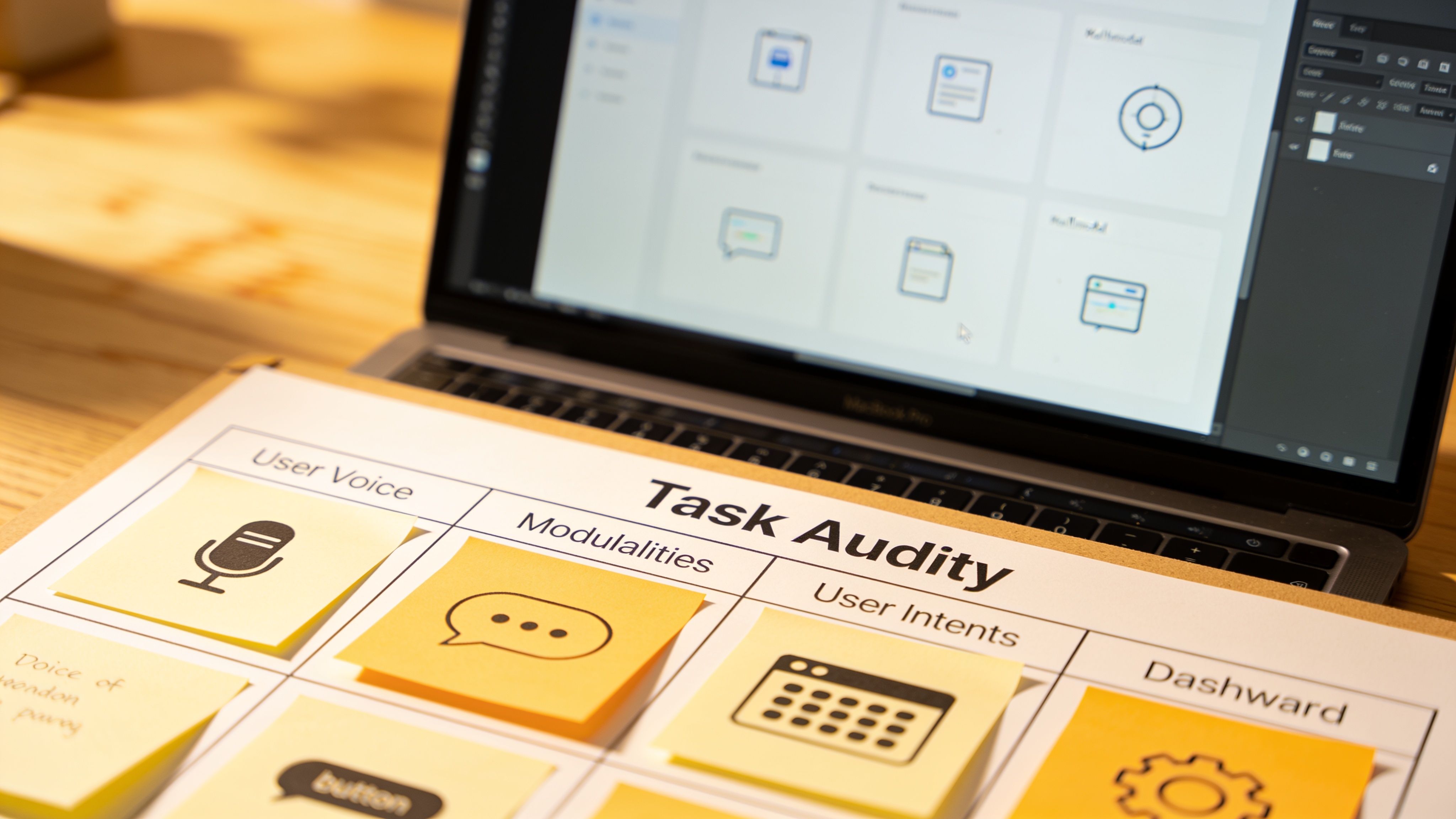
The Task Audit: Matching AI Modality to User Intent
So how do you decide which modality fits a given task? I use a lightweight task audit that looks at four constraints. This is your framework for matching AI modality to user intent without falling back on a chat window "just because".
1. Cognitive Load
How much thinking does the task demand? For example, comparing three insurance plan options is heavy; confirming your home address is light. High cognitive load tasks often benefit from visual summaries and direct comparisons (dashboards, tables). Purely conversational interfaces force the user to hold multiple pieces of information in memory, a recipe for mistakes.
2. Context of Use
Where is the user, and what else are they doing? If they are on a factory floor with earmuffs, voice output and gesture input are your friends. If they are in a quiet open-plan office, audio is inappropriate. A driver needs hands-free, eyes-free voice interaction; a shopper holding a toddler needs one-thumb tap targets.
3. Data Complexity
Is the information spatial, chronological, numeric, or heavily interlinked? A map showing "nearby service centres" is closer to the user's mental model than a paragraph of addresses. Visual dashboards or interactive canvases make complex data immediately digestible. Chat-based output that reads out a list of coordinates one line at a time burns time and patience.
4. Urgency
A stock trader seeing a price alert needs a push notification and a tap-to-trade button in seconds. A user searching for "best pizza dough recipe" on a Sunday afternoon can handle a longer, more exploratory conversational thread. Match the pace of the interface to the pace of the decision.
Implementing an interface that flexes across these modalities requires a solid technical foundation. You need a site that loads fast enough that voice replies fire instantly, and a design system that handles interactive dashboards and tap targets without becoming a maintenance nightmare. This is where custom web design built for performance and ongoing website optimization become essential. An ambitious multimodal feature on a sluggishly loading site is like fitting a sports car engine into a rusty truck.
Input/Output Alignment Matrix (by User Intent)
Let's make the framework concrete. Here is a decision matrix that maps common user intents to the input and output modalities that tend to outperform chat.
| User Intent | Recommended Input | Recommended Output | Why |
|---|---|---|---|
| Check order status | Button tap or voice command | Inline confirmation + optional short text summary | Low cognitive load, high frequency, need for speed |
| Compare product specs | GUI sliders, checkboxes, drag-drop | Side-by-side visual dashboard | Data complexity demands spatial presentation |
| Book an urgent service | One-tap pre-filled button, voice as fallback | Push notification + calendar visual | Urgency and need for instant confirmation |
| Report a complex issue | Multi-modal (photo + text description) | Inline confirmation with a trackable dashboard link | Rich context reduces back-and-forth, visual output builds trust |
| Explore new features | Natural language chat, guided tour buttons | Interactive canvas that highlights the feature in context | Exploration benefits from guided narrative plus hands-on tinkering |
| Alert about a safety outage | Voice (off-screen), gesture for acknowledge | Audio summary + push alert that stays on lockscreen | Hands-busy, eyes-busy context with life-safety implications |
This isn't rigid. Many tasks will blend modalities. The point is to start with intent and let that drive the interface, not try to retrofit 18 different intents into a single chat bubble.
Real-World Case Study: Field Technicians and Adaptive Handoff
A national utility company recently redesigned how its field technicians interact with an AI diagnostic tool. Before the redesign, the tool offered a standard chat interface on a ruggedized tablet. Technicians, often standing in front of open equipment bays with voltmeters in both hands, would struggle to type. Error rates were high. Adoption stagnated.
The revamp introduced an adaptive handoff model:
- Inspection start: A single glove-friendly tap ("Start Diagnostic") initiates the process.
- Data gathering: Voice commands capture equipment readings ("voltage 230, phase A"), with audio playback confirming what was heard.
- Complex results: The system swaps to a visual dashboard showing waveform graphs and colour-coded pass/fail zones, letting the technician spot anomalies at a glance.
- Reporting: A spoken summary is automatically generated, which the tech can approve with a thumb gesture.
The result? Diagnostic time dropped by 20%, and tool adoption among field crews nearly doubled. No one missed the chat box. The techs simply got their job done faster, with fewer errors, and with far less cursing at a screen.
Accessibility Must Be Designed In, Not Added Later
Whenever we talk about modality choice, accessibility can't be an afterthought. You can't bolt a screen reader alternative onto a pure chat interface and call it a day. Real inclusion means that a blind user can get the same task done via audio output and voice input, while a user with a motor impairment can rely on granular tap targets or gesture navigation, not a fine-motor-demanding text box.
Cognitive disabilities are especially relevant here. As we covered in our piece on how cognitive inclusion in UX research improves website accessibility, simplifying the cognitive burden of a task by choosing the right modality helps far more people than you might think. A visual timeline is easier for someone with dyslexia to parse than a long chatbot monologue. A simple voice command may be the only viable path for a user with working-memory challenges.
Building those inclusive interfaces, and then keeping them fast, up-to-date, and compatible with evolving accessibility standards, is not a one-time job. Regular website support audits and performance optimization sweeps ensure that the voice responses stay snappy, the dashboards render without visual glitches, and the gesture controls respond within the 100ms window that feels instant. When you design for multiple modalities from day one, you end up with a product that works for a wider, more loyal audience.
How to Run a Lightweight Task Audit This Week
You don't need a six-month research study to start making better modality decisions. Grab your team next Thursday morning and run a 90-minute session using this simple template.
- List the top 10 user tasks your product supports (ignore AI for a moment). For each task, write down one sentence describing what the user wants to accomplish.
- Score each task on the four constraints: cognitive load (low/medium/high), context (desk, walking, driving, noisy, etc.), data complexity (simple, numerical, spatial, temporal), and urgency (low/medium/high).
- Circle the worst-fit modality: Look at every task you currently force through a chat interface and ask, "Would a button, a visual, a voice command, or a combination make this noticeably faster or less error-prone?"
- Sketch a 2-state prototype: On a whiteboard, draw the current chat flow, then right next to it draw an alternative that uses the most promising modalities from the alignment matrix. Show it to two real users, not your co-founder.
- Measure and iterate: Even a single metric (time-on-task or one-question satisfaction) will tell you if you're on the right path.
This lightweight task audit is exactly the kind of activity that separates the 58% of companies that kept their AI projects alive in 2025 from the 42% that buried them. It forces you to look at intent before interface, and that changes everything.
Once you have a design direction, you'll need a web platform that can serve those mixed-modality experiences reliably. Whether you are building tap targets that never miss a click, dashboards that update in real time, or voice interactions that rely on lightning-fast API responses, a solid hosting, maintenance, and optimization setup is the quiet engine underneath it all. Without it, even the smartest modality choice can buckle under real-world load.
There Is No Default Modality
Chat is one tool on the shelf. It's not the only tool, and it's certainly not the best tool for most of the jobs we assign it to. When your users are mentally drained, abandoning sessions, or silently switching to a competitor after one frustrating exchange, the fix rarely lies in making the chatbot "smarter". The fix lies in noticing that a simple button, a spoken answer, or a live dashboard would have done the work in half the time with none of the friction.
Matching AI modality to user intent is the real design work ahead of us. Run the audit. Respect the context. And never, ever use a chat bubble where a one-tap "Solve this" button will do.
Related Articles
Continue reading with these related posts
Ready to Start Your Project?
Let's build something amazing together. Get in touch to discuss your next project.
Contact Us Today