Modal vs Separate Page UX: Conversion Decision Tree
Modal vs. Separate Page: UX Decision Tree for Better Conversions
Most websites default to modals for signups, announcements, and quick actions. The numbers paint a shockingly different picture: dedicated landing pages convert five to seven times higher on average than modals. Wisepops data puts the average modal conversion rate at 4.82%, while Popupsmart reports 3.49%. Dedicated pages, meanwhile, average 23% (median around 4.02%) and the top performers hit nearly 39%.
But that doesn’t mean modals are always wrong. Vitaly Friedman, author of the Smart Interface Design Patterns course, calls modals “disruptive, annoying, and frustrating,” yet concedes they can be useful when you need user input without losing context. The real challenge is knowing when the modal vs separate page UX decision tips the balance toward more conversions, not fewer.
Here’s a practical, stat-backed framework you can start using on your own site today.
The Core Trade-off: Commitment vs. Friction
A modal keeps the user on the same page. It demands attention but also blocks the underlying content. That can be an advantage when you don’t want someone to lose their place in a product list or an article. But it becomes a conversion killer the moment the task requires more thinking, more clicks, or more trust.
A separate page gives the user space. It removes distractions and lets you structure a flow with progress indicators, reassurance copy, and a focused call to action. The cost is a temporary context switch. For high-commitment actions, that switch is exactly what the user needs.
Think of it this way: a modal is like tapping someone on the shoulder mid-conversation to ask a one-word question. A separate page is inviting them into a quiet room to have a proper discussion.
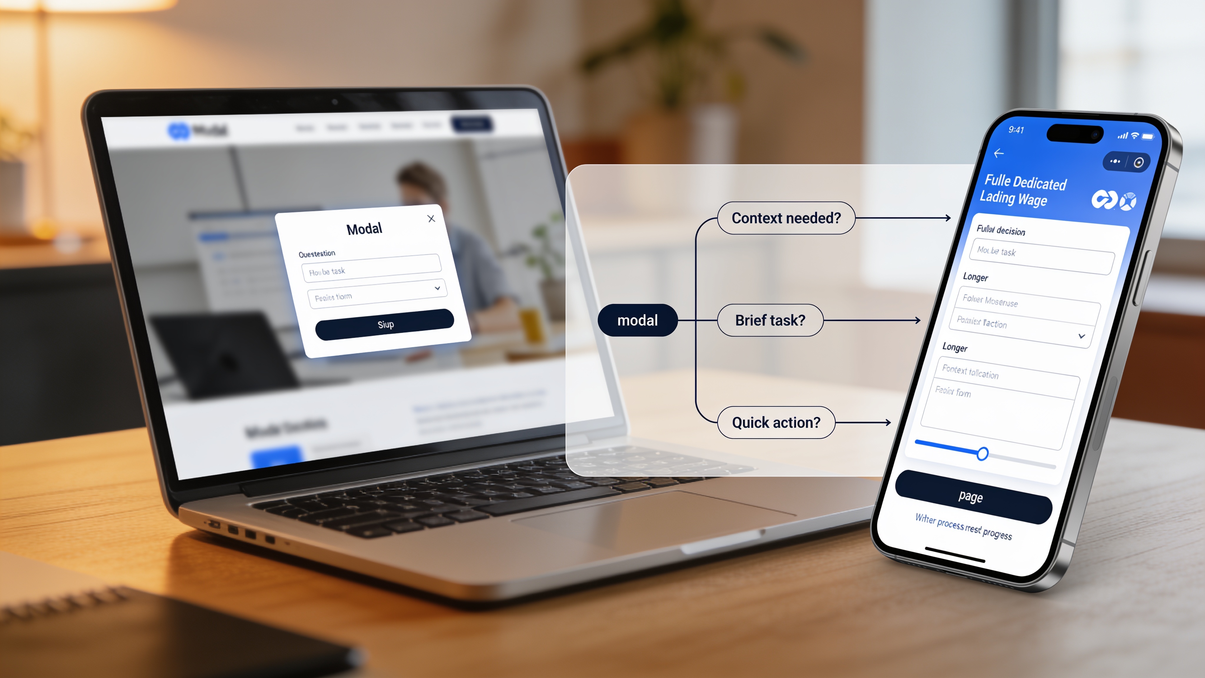
The 4-Question Decision Framework
Run every potential modal or page split through these four questions. It’s the same decision tree based on work by Vitaly Friedman and the UX teams at Smashing Magazine, refined here with real conversion numbers.
| Question | If Yes | If No |
|---|---|---|
| 1. Does the user need to stay in the same visual context to complete the task? | Proceed to question 2 | Use a separate page |
| 2. Is the task self-contained, with no extra navigation or information needed? | Proceed to question 3 | Use a separate page |
| 3. Can the user realistically finish the task in under one minute? | Proceed to question 4 | Use a separate page |
| 4. Is the action a single step or immediately reversible? | Use a modal | Use a separate page |
A helpful shorthand, the “one-second heuristic,” comes from several UX research teams: if you can answer the user’s core intent in a second, a modal works. If the task demands more than a minute of focused attention, a page almost always wins.
When Modals Usually Win
Modals succeed when they respect the user’s current flow and don’t overstay their welcome. The data bears this out. Modals used for simple email captures that appear after a delay, not immediately on load, consistently hit the higher end of that 3–5% range. Wisepops found that A/B tested, behavior-triggered modals improve conversion to around 5.3%.
Good use cases:
- Quick, optional newsletter signup after the user has scrolled 70% of a blog post
- Confirming a destructive action (delete, cancel) where the alternative is irreversible
- A short feedback prompt after a completed checkout step
- A one-field discount code entry when the user hovers over the back button
Modals also work slightly better on mobile than desktop: 4.98% vs 3.67% average conversion, according to Popupsmart benchmarks. That may reflect how full-screen phone modals feel more natural, though they must include an obvious close button and be thumb-friendly.
When Separate Pages Almost Always Convert Better
If the user must make more than one or two decisions, or if they need to feel secure about entering payment details, use a dedicated page. In high-stakes flows, modals break trust. They can even trigger popup blindness, where users reflexively dismiss without reading.
Do not put these inside a modal:
- Checkout or payment (people want a dedicated, secure environment)
- Multi-step forms with more than 2–3 fields
- Onboarding sequences (Spotify and Duolingo both use full, focused pages)
- Long legal disclosures or account settings
- Any task requiring a user to open another reference
The conversion gap here is significant. A dedicated signup page with clear value props and a focused design routinely outperforms the same form shoved into a modal by a factor of two to four in real client A/B tests I’ve seen over the last year.
Real-World Patterns That Outperform Both
You’re not stuck choosing between a cramped modal and a full page. Several hybrid approaches sidestep the downsides of both.
Side drawers and sliding panels. Linear and Intercom use a panel that slides out from the side, letting users edit a task or view details without losing the list behind it. The background remains partially visible, preserving context while offering far more room than a centered modal.
Modal preview with page expansion. Notion and Airtable allow you to preview a database item in a modal. A prominent “Open as Page” button expands it to a full view if the user needs deeper editing. This two-tier approach respects both quick glances and deep work.
Inline editing and progressive disclosure. For repeated lightweight edits, Salesforce and Jira keep everything on-page, revealing extra fields inline only when needed. No modal at all. This works beautifully when the user performs the action many times in a session.
These patterns handle the modal vs separate page UX tension by giving users control over how much focus they commit.
Common Mistakes That Kill Conversions
Small missteps can undo even a well-intentioned choice. Avoid these traps.
- Auto-triggered modals on arrival. A popup that greets visitors immediately annoys rather than converts. Delay any trigger until a user has shown interest, such as after scrolling or viewing multiple pages.
- Nesting a modal inside another modal. It disorients users and creates accessibility nightmares. Never do it.
- Missing an obvious close option. If a user can’t hit Esc, tap outside, or find a large X, they’ll bounce out of frustration, not convert.
- Putting high-commitment CTAs inside a tiny box. A “Start Free Trial” button with a long signup form inside a 400-pixel modal signals low trust. Users expect a full page they can examine.
How to Test and Measure the Choice
You don’t have to guess. A simple A/B test can validate which pattern works for your specific audience.
Tag every click to open a modal or page as an event in your analytics. Track the rate at which users complete the intended action from each entry point. A modal that gets more opens but fewer completions than a dedicated page isn’t winning, it’s just generating false-positives.
Observation without action is wasted insight. To iterate on a page-vs-modal split, you need a reliable testing environment where variants load at identical speed. Slow hosting can skew results and mislead you into blaming the design when latency is the real culprit. Our website setup & hosting ensures your test pages serve from a fast CDN, so you measure what actually matters. And our complete optimization guide walks through how to prepare clean test variants.
Quick Checklist and Final Rule of Thumb
Before you ship, run through this checklist.
- Did you clearly identify the one job the user needs to do?
- If it’s a modal, can they finish it in under a minute without scrolling heavily?
- Did you provide an easy, obvious way to close it?
- If it’s a page, did you strip away non-essential navigation so the user stays focused?
- Is the CTA text specific (“Get the report”) rather than generic (“Submit”)?
- Have you tested it on a real phone with your thumb holding the device normally?
Use modals for small, reversible, context-preserving actions. Use dedicated pages for anything that requires real headspace. When in doubt, default to a page. It’s far easier to turn a page into something simple than to cram a complex experience into a box that users dismiss before reading.
Ready to turn insights into growth?
We’ll help you audit your current modal vs page choices and tune your site for both speed and conversions.
Ready to Start Your Project?
Let's build something amazing together. Get in touch to discuss your next project.
Contact Us Today