How Cognitive Inclusion in UX Research Improves Website Accessibility

How Cognitive Inclusion in UX Research Improves Website Accessibility
About 13.9% of U.S. adults live with a cognitive disability that affects memory, attention, or information processing. Yet most website usability tests never include them. Cognitive inclusion in UX research changes that: it deliberately brings people with cognitive disabilities and neurodivergence into the design process. The payoff is immediate. You stop building pages that confuse and frustrate, and you start creating experiences that work smoothly for far more visitors.
What Cognitive Inclusion Actually Means
Cognitive inclusion isn’t about checking off a compliance list. It’s the practice of recruiting participants with cognitive disabilities (ADHD, autism, dyslexia, learning disabilities, age-related cognitive changes, or even temporary states like fatigue) for usability studies. The goal is to understand how their memory, attention, and cognitive load interact with your interface. Jargon break: cognitive load is the mental effort needed to use something. High cognitive load tires people out and causes errors. Executive function is the brain’s ability to plan, focus, and handle multiple steps. When a checkout process forces someone to hold item prices in their head while switching tabs, that taxes executive function.
Traditional accessibility testing often stops at visual, auditory, and motor impairments. Cognitive barriers get overlooked because automated tools can’t measure them. Including cognitive users makes invisible friction visible.
The Scale of the Challenge
13.9% of U.S. adults have a cognitive disability that impacts processing (CDC BRFSS). On top of that, 54% of U.S. adults read below a 6th-grade reading level. That’s not a niche audience; it’s likely a large chunk of your customers.
The legal and financial stakes are climbing fast. In the first half of 2025, more than 2,000 ADA website lawsuits were filed in the U.S., a 37% jump year-over-year. The Click-Away Pound 2025 survey found that 71% of users with disabilities leave a website immediately after hitting an accessibility barrier, taking an estimated £120 billion in UK annual revenue with them. Stateside, the lost revenue number is in the hundreds of billions.
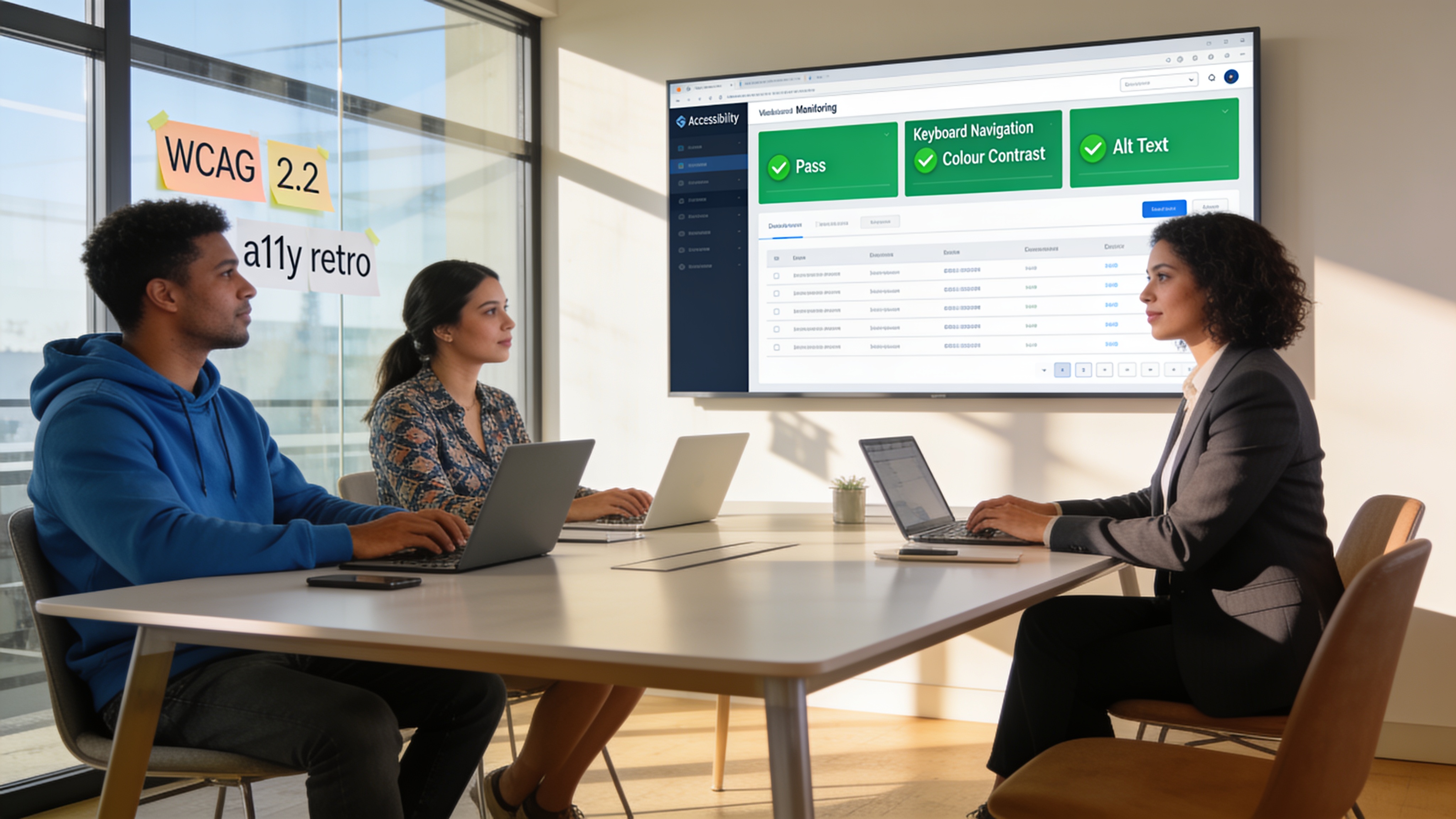
Regulatory deadlines are real. The Department of Justice’s Title II final rule now mandates that state and local government websites meet WCAG 2.1 AA by April 2027. Across the Atlantic, the European Accessibility Act began enforcement in June 2025, pushing WCAG 2.2 standards. Even if your business isn’t a government agency, these requirements signal where private-sector expectations (and lawsuits) are headed.
And the current state of the web? Grim. WebAIM’s Million report shows only 2–5% of the top million homepages pass 70% or more of WCAG testable criteria. The vast majority of sites still fail.
Why Traditional Accessibility Testing Misses Cognitive Needs
Most accessibility audits lean on automated scanners. They catch missing alt text, color contrast issues, and form labels. They don’t catch that your navigation menu requires remembering where the “settings” option is hidden after two clicks. They don’t flag that your refund form language assumes a university-level reading ability. They can’t tell you that a pop-up countdown timer spikes anxiety for someone with ADHD.
If your research stops with an automated report or a screen reader test, you are designing on incomplete data. Cognitive inclusion fills that gap.
Lessons from Exploratory Studies with Cognitive Users
When researchers from organizations like W3C’s COGA task force and inclusive design consultancies run studies with cognitive participants, a few patterns keep surfacing:
- Participants want to be treated as co-designers, not test subjects. Frame the session as “helping us improve,” not a performance evaluation.
- Concrete tasks work better than hypothetical scenarios. Show a real product page and ask them to find the vegan option rather than ask, “How would you search for dietary preferences?”
- Gentle, frequent prompts keep people on track without pressure. A simple “Take your time, there’s no rush” rewrites the power dynamic.
- Functional needs matter more than medical labels. Screen participants for challenges like “Do you sometimes struggle with memory when filling out long forms?” rather than asking for a diagnosis.
These adjustments produce richer data. You learn where minds get stuck, not just where the code breaks.
How to Conduct UX Research with Cognitive Participants
Here’s a step-by-step method for including cognitive users in usability testing, adapted from best practices.
- Define clear, measurable task goals. Instead of “explore the site,” pick “find the return policy for an international order and start a return.” The narrower the goal, the easier it is to spot where the process breaks down.
- Recruit 5–8 participants per functional group. Use screening questions about cognitive behaviors, not diagnoses. For example: “Do you find it hard to keep your place when a webpage has multiple sections that move or refresh?” or “Do you often re-read sentences because the language feels dense?”
- Choose tasks that represent frequent, high-stakes actions. Logging in, paying a bill, resetting a password, requesting support. These are make-or-break moments for your business.
- Prepare plain-language materials. Consent forms, task instructions, and observer notes should be at a 6th-to-8th grade reading level. Use icons and short sentences. Offer response modes beyond verbal think-aloud: sketch notes, emoji cards, or showing where they would click.
- Run moderated sessions with built-in check-ins. A cognitive walkthrough works well: ask the participant to narrate what they see and what they expect to happen before they tap. Schedule a break every 20 minutes. Never rush.
- Analyze for patterns in decision points and mental shortcuts. Look for where participants paused, backtracked, or invented their own path. Note language misunderstandings and moments of obvious cognitive fatigue.
- Iterate and re-test. Change the most confusing flows, then bring the same group back or recruit a new cohort to confirm you’ve reduced the load.
Teams that do this even once find dozens of quick wins they would have missed forever.
Design Outcomes That Emerge from This Research
What actually changes after including cognitive users? Here are design patterns that repeatedly surface and align with WCAG 2.2’s new cognitive success criteria.
- Plain language and short paragraphs. Content written at a 9-year-old reading level isn’t dumbing down; it’s speeding up comprehension for everyone. Use the first sentence of a paragraph to state your point, then explain.
- Consistent, predictable navigation. Keep the main menu, search bar, and back button in the same spot on every page. Cognitive users rely on muscle memory. Unexpected moves increase mental load and abandonment.
- No memory-dependent tasks. Visible controls, like a “Show password” toggle or a progress indicator, prevent forcing people to remember what they entered three steps ago. WCAG’s Redundant Entry rule says users should not have to re-enter information they already provided.
- Extended times and save-where-you-left-off. Timed sessions without warnings punish slow processors. Allow users to extend a time limit or auto-save form input so they can come back.
- Clear error messages with undo. Instead of “Invalid input,” say “The card number is missing 3 digits. Please fill in the full 16-digit number.” And always offer an obvious way to correct a mistake.
If you need help auditing your current site for these cognitive barriers, a one-time website optimization can provide a before-and-after report that uncovers exactly where the load is heaviest.
Real-World Examples & Results
You don’t have to guess that this works. Open evidence already exists.
Spotify introduced a Focus Mode that reduced on-screen distractions. Among users with ADHD, adoption hit 60% because it directly addressed their need to filter cognitive noise. That same feature helped commuters and busy parents stay on task.
GOV.UK built its entire platform around an average 9-year-old reading level and step-by-step conversational flows. Independent audits show clear, task-completion jumps across cognitive and non-cognitive groups.
iFactory and Empire State University chunked course content with visual summaries and clear top-level menus. Students with neurodivergence reported higher engagement and lower drop rates. All students benefited from the cleaner structure.
Microsoft’s Inclusive Design for Cognition toolkit shows that features like auto-save, focus reminders, and literal icon labels took internal tool adoption up and reduced support tickets by large margins.
These aren’t edge-case improvements. They’re mainstream business wins.
Common Mistakes & Myths to Avoid
- Myth: “Accessibility only helps a small percentage.” Reality: when you fix cognitive friction, you make your site faster and easier for stressed, hurried, or less tech-savvy customers, too. That’s most of your audience.
- Myth: “Automated tools cover everything.” Scanners miss over two-thirds of accessibility barriers. They can’t evaluate whether your language matches user mental models or whether your error handling triggers anxiety.
- Pitfall: Confusing cognitive inclusion with a one-time project. You cannot “test once and done.” As your site adds features, the cognitive load shifts. Embedding cognitive research into your design cadence keeps the experience inclusive. That’s where ongoing website maintenance becomes useful: daily checks and monthly reports catch regressions that degrade cognitive accessibility over time.
Getting Started – Practical Next Steps for Teams
Start small. Run one study with three concrete tasks and five participants recruited through functional screening. Use a quiet room, a prototype, and a colleague comfortable with pausing and reassuring. The patterns you find will surprise you.
From there, document your design principles. Create a short cognitive checklist for future releases: Is the language plain? Are error messages clear? Can a person complete the main flow without relying on memory? If the answer to any of these is no, you have a priority for the next cycle.
If you want expert help, we conduct thorough accessibility-focused audits as part of our website optimization service. Our team maps cognitive hot spots in your user flows and hands you a ranked list of fixable issues. And when you need someone to keep things running smoothly, our maintenance plans monitor daily performance, update plugins, check broken links, and ensure those cognitive-friendly patterns stay intact as your site grows.
Finally, if you have ongoing questions about how a chosen design change affects different user groups, our website support service puts quick, expert answers on tap, without the cost of a full consultancy.
FAQ
Does cognitive accessibility really help my SEO? Yes. Clear headings, plain language, breadcrumb navigation, and descriptive link text are all core SEO signals. Google’s helpful content system rewards readability and structure. When you optimize for cognitive users, you tend to write better content that search engines understand more easily.
How does WCAG 2.2 differ from 2.1 for cognitive needs? WCAG 2.1 included some cognitive criteria like Error Suggestion and Headings and Labels. WCAG 2.2 added Findable Help, Visible Controls, Redundant Entry, and Accessible Authentication. These target memory, orientation, and input assistance directly.
Is cognitive inclusion legally required for private businesses? In the U.S., the ADA does not explicitly name cognitive accessibility, but courts are increasingly interpreting the ADA to require websites to be usable by people with cognitive disabilities. In the EU, the European Accessibility Act applies to many private-sector sites and services and references WCAG 2.2, which includes cognitive success criteria. Regardless of jurisdiction, reducing legal exposure is a smart side effect of better design.
How much does a cognitive accessibility audit cost? Costs vary widely. Some agencies charge thousands for a full WCAG audit with user testing. A one-time optimization audit that includes cognitive barrier identification can be much more affordable. The return comes from lower bounce rates, higher conversions, and reduced legal risk.
Ready to Build a Cognitively Inclusive Site?
Start with a deep dive into your site’s barriers - and a clear plan to fix them.
Ready to Start Your Project?
Let's build something amazing together. Get in touch to discuss your next project.
Contact Us Today