Persuasive Design for Conversions: 10 Years Later – What Still Works in 2026
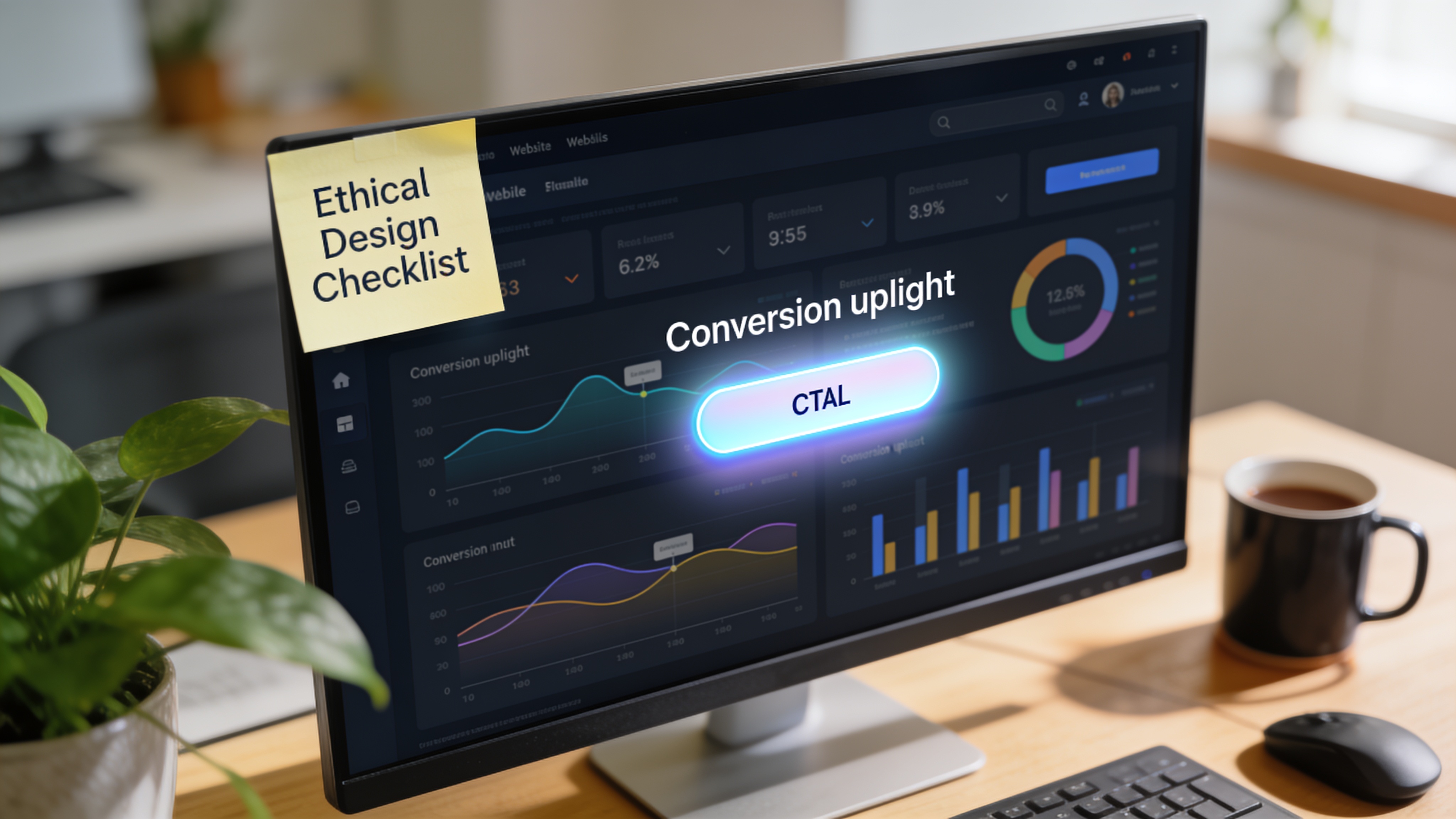
Persuasive Design for Conversions: 10 Years Later – What Still Works in 2026
Website conversion rates dropped 6.1% in 2025 while acquisition costs climbed. The sites that held their ground were the ones that removed friction and motivated visitors to act. That is where persuasive design for conversions earns its keep. Not the flashy gamification tricks of a decade ago, but a discipline built on behavioral science, context, and ethics. After ten years of testing and refinement, here is what still moves the needle.
What Persuasive Design for Conversions Actually Means Today
Persuasive design is a subset of UX design that uses principles from behavioral psychology to increase a user's motivation to take a desired action: signing up, buying, subscribing, or returning. Usability removes the obstacles; persuasive design adds the reasons. Together they move someone from "I can do this" to "I want to do this."
The term has been around for years, but the definition sharpened after the industry saw what does not work. Anders Toxboe, who helped formalize the early persuasive design patterns, revisited the landscape in a 2026 update titled Ten Years Later. His core message: persuasive design is no longer a fixed playbook of gamification badges and pop-ups. It is a set of informed guesses rooted in real user context, not a set of plug-and-play nudges.
Usability vs. Persuasive Design for Conversions: Why You Need Both
Think of usability as the pavement: smooth, clear, free of potholes. Persuasive design is the navigation sign that tells you why the destination is worth the trip.
A site can load in under two seconds, have perfect accessibility, and still convert poorly because nothing pushes the visitor across the finish line. The reverse is also true: you can hype a product with urgency and social proof, but if the checkout form has ten unnecessary fields, people bail. Forrester research (frequently cited by VWO) shows that optimized UX, including persuasive elements, can lift conversions by up to 400%. UI design alone can deliver a 200% increase. The compound effect of blending both is where the real gains live.
The Shift from Patterns to Context (Toxboe's 2026 Update)
Toxboe's latest work draws a line under the pattern-first era. Instead of asking "Which gamification pattern can I add here?", the starting question becomes: "What is really going on in our users' lives?" He recommends using the COM-B model (Capability, Opportunity, Motivation – Behavior) to diagnose barriers before designing any nudge. An explicit "Dark Reality" ethics check is now part of the workflow, forcing teams to ask whether their design would feel manipulative to a real person.
What came out of that shift is a pair of card decks (Conversions & Decisions and Habits & Engagement) designed to help teams brainstorm context-appropriate nudges rather than copy-paste a leaderboard. The underlying principle: persuasive design is now a thinking tool, not a silver bullet.
Six Persuasive Elements That Still Drive Conversions
Despite the evolution, a handful of tactics have proven durable. They survive because they align with how humans actually make decisions.
- Social proof. Reviews, testimonials, user counts, and real-time activity signals consistently lift trust. LinkedIn increased notification opt-ins by 500% by combining social proof with salience.
- Benefit-focused, high-contrast CTAs. Buttons that say what the user gets, not what the system needs. "Start my free trial" outperforms "Submit" every time.
- Friction reduction. Short forms, smart defaults, and chunking. Contentsquare's 2025 benchmark found that sites reducing friction experienced 4.5x less churn than those that did not.
- Authentic trust signals. Security badges, transparent pricing, and real contact information. These are table stakes, not differentiators, but their absence kills conversions.
- Clear visual hierarchy. When users scan a page, their eyes should land on the most important element within 0.2 seconds. Anything that fights that hierarchy creates cognitive load.
- Ethical scarcity and urgency. Only when it is genuine. Uber Eats saw a sales uplift by showing real-time driver availability without fabricating false deadlines.
Real-World Results That Mirror Today's Reality
Blinkist redesigned its trial flow using reciprocity (giving something valuable before asking) and cut unnecessary form fields. Result: a 23% increase in trial conversions. LinkedIn used salience and social proof to push notification opt-ins upward by five times. Uber Eats ran messaging that honestly reflected near-real-time delivery capacity, and sales rose. In each case, the win came from matching the nudge to the user's genuine decision moment, not from layering on a hollow game mechanic.
These results are not outliers. The average e-commerce conversion rate sits between 1.84% and 3.71%. Top-performing sites, the ones that obsess over both usability and motivation, consistently reach 15–20%.
What Stopped Working (And Why Gamification Often Fails)
Shallow gamification was the biggest casualty of the past decade. Points, badges, and leaderboards bolted onto a checkout flow produced short-lived spikes followed by flatlines. Users saw through the manipulation, and once the novelty wore off, the cognitive load remained.
Isolated nudges suffered the same fate. A single urgency timer, a pop-up with no context, or a forced social proof widget can feel like a cheap trick. Toxboe calls this the pattern-first trap: choose a tactic before understanding the situation, and you get a short-term lift at the cost of long-term trust.
How to Apply Persuasive Design Ethically (A Step-by-Step Framework)
Ethical persuasive design is not about avoiding all influence; it is about aligning the nudge with the user's existing goals. A practical framework looks like this:
- Diagnose the user's real context. Interviews, session recordings, and heatmaps reveal where motivation drops.
- Map the behavioral barriers. Use COM-B: Is the user unable, unmotivated, or lacking a timely trigger?
- Design a subtle nudge that removes the barrier. Social proof where trust is low, friction reduction where steps pile up, or a clarity-focused CTA where intent is fuzzy.
- Run a Dark Reality check. Ask your team: "If my mother saw this, would she feel respected or tricked?" If the answer is the latter, redesign.
- Test with real users and iterate. A/B test the variant against the original, but keep the ethical guardrails in place.
- Never ignore performance and accessibility. A page that loads in under 2–3 seconds and works for everyone is the prerequisite for any persuasive layer to function.
This process is not a one-time project. It lives inside a continuous improvement cycle, just like security patches and content updates.
Common Mistakes Teams Still Make
Several errors show up again and again, even among experienced teams:
- Overloading a page with multiple CTAs. When every section screams for attention, the user picks none.
- Using fake scarcity. If the "only 2 left" banner resets on refresh, the brand credibility resets too.
- Treating persuasive design as a shortcut. It does not fix a broken product or a confusing value proposition.
- Skipping user research. Assumptions about what motivates your audience are usually wrong.
- Ignoring accessibility. Removing friction for 20% of users while excluding the rest is a losing strategy.
How to Get Started on Your Site
Begin with an honest audit of your highest-traffic landing pages. Look for moments where users hesitate or drop off. Check your CTAs: do they promise a clear, specific benefit? Strip out unnecessary form fields. Add genuine social proof: a few customer quotes, a case study, a live counter of users served.
If you want a deeper, data-backed diagnosis, a professional website optimization audit can map your conversion gaps against established behavioral patterns and deliver a prioritized plan. Once improvements are live, ongoing tweaks matter. A maintenance plan that includes regular speed checks, broken link detection, and performance reviews keeps your persuasive layers sharp as user expectations shift.
Related Articles
Continue reading with these related posts

Ready to Start Your Project?
Let's build something amazing together. Get in touch to discuss your next project.
Contact Us Today