Streak System UX: The Psychology That Makes Streaks Addictive
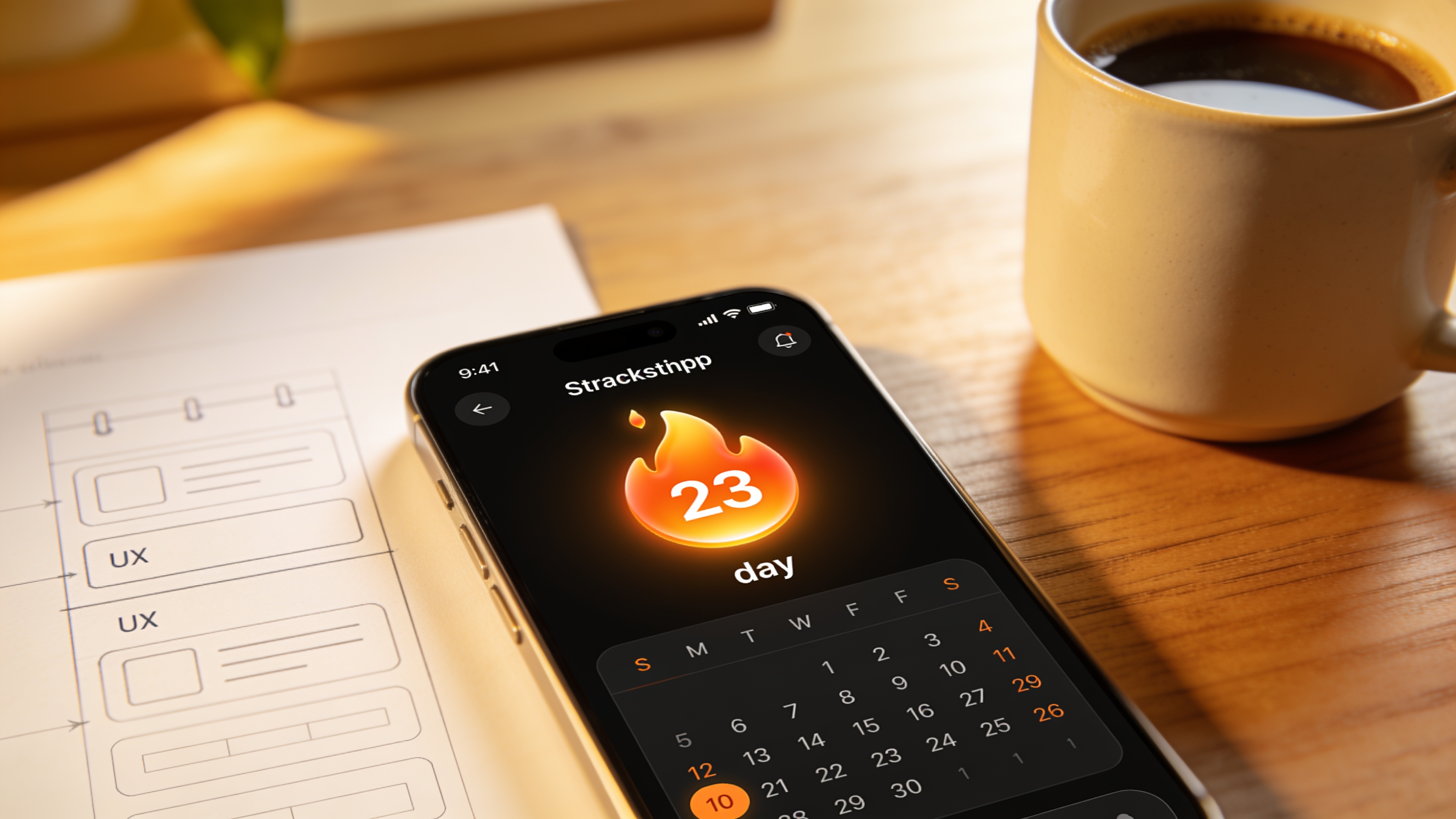
Streak System UX: The Psychology That Makes Streaks Addictive
A streak counter looks simple. A number ticks up each day, and you feel a tiny spike of satisfaction. Done right, a streak system can transform casual visitors into loyal daily users. Done wrong, it suffocates them with obligation. The difference? Understanding the psychology that makes streaks so addictive, and then building a streak system UX that respects the human behind the screen.
The Core Psychological Drivers Behind Streaks
Streaks don't just track days. They weaponize a handful of well-researched behavioral biases that you feel in your gut the moment you risk losing one.
The strongest force is loss aversion. Psychologists Daniel Kahneman and Amos Tversky showed that the pain of losing something is roughly twice as powerful as the pleasure of gaining the same thing. When you see a 30-day streak, your brain registers it as something you own. The thought of seeing it reset to zero hurts far more than the joy of seeing 31.
Then there's the endowed progress effect, identified by researchers Nunes and Drèze. People are more committed to finishing a task if they believe they've already made a start. Duolingo exploits this brilliantly. Even a two-day streak feels like a head start; walking away would mean wasting that initial effort.
The Zeigarnik effect adds another layer. Incomplete tasks create mental tension. An unbroken sequence of days becomes a loop your brain wants to close, and the only way to close that loop is to keep the streak alive.
Finally, the Fogg Behavior Model (B = MAP) gives a practical framework. A behavior happens when three things converge at once: Motivation, Ability, and a Prompt. A streak simplifies all three. The motivation is the desire to keep the chain unbroken. Ability is often just tapping a button. And the prompt is the timely notification that nudges you to act before the day ends.
Why Streaks Become Identity Symbols
A streak stops being a number. It becomes proof of who you are. Lose the streak, and you lose a piece of that identity.
Duolingo's green owl has turned millions of users into people who say, "I don't skip a day." The company reported that next-day retention jumped from 12% to 55% after introducing streak features. Users on a 7-day or longer streak are 3.6 times more likely to complete their course and 2.7 times more likely to still be on the platform 30 days later. Over 8.4 million people maintain streaks beyond a full year.
Snapchat took identity a step further. Its streak began as a simple fire emoji next to a friend's name, but it rapidly grew into a social badge. The longest recorded streak surpassed 4,000 days. For many teenagers, breaking that streak means damaging a relationship, not just a counter.
Both apps show the same pattern: when a streak ties into how you see yourself or how others see you, the cost of breaking it feels existential.
The Double-Edged Sword: When Streaks Become a Burden
Streaks build habit. But there's a dark edge. After about 50 days, Duolingo discovered that many users experience genuine anxiety. The streak that once nudged them now controlled them.
The company reduced overall churn from 47% to 28% with streak mechanics, and daily active users grew 36% year over year, a rise product leadership largely attributed to streaks. Yet the same data showed that an accidental break often meant permanent abandonment. A single missed day and the user thought, "I've ruined it. Why bother opening the app again?"
Duolingo responded by refining its streak animations, which alone added 1.7% to 7-day retention. They also shifted philosophy: forgiveness first. Instead of punishing a miss, the product focused on helping users recover.
Rescue Mechanics That Keep Users Returning
A streak system that doesn't forgive failure will eventually punish every user. Real life interrupts even the most dedicated habits.
The most effective rescue feature is Streak Freeze, which Duolingo introduced as an item users could equip in advance. When the rollout happened, the average streak length past 7 days leaped by 48%. More importantly, users who broke a streak but had a Freeze active were 11% more likely to still use the app 30 days later compared to those who simply crashed out cold. A later refinement that capped active Freezes at two simultaneously added another 0.38% to daily active users.
Other recovery patterns work too:
- Grace periods that allow a missed day to be "made up" within 24 hours, reducing the all-or-nothing panic.
- Pause buttons for vacations or planned breaks, so the streak isn't broken but paused, preserving ownership.
- Loss framing that rebuilds hope: “You lost your streak, but you kept 23 days of progress. Start a new one now and pick up where you left off.”
All of these should be available from launch, not patched in after users have already burned out.
A Step-by-Step UX Framework for Ethical Streak Systems
Victor Ayomipo, a behavioral designer who applies the Fogg Model in product work, recommends a five-point checklist. This checklist turns the psychology into a concrete UX plan:
-
Define only on behaviors that are genuinely habitual and regular. Daily meditation? Yes. Monthly financial report review? No. The action must be something the user can realistically show up for every day without friction.
-
Provide immediate visual feedback with evolving milestones. A simple flame or calendar that transforms at day 7, 30, 100, and 365 keeps the experience fresh and signals progress.
-
Use timely, non-intrusive prompts. A notification that arrives two hours before the user's usual practice time respects their rhythm. A notification fired at midnight creates stress.
-
Let intrinsic messaging dominate. “You're building a valuable skill” works better than “Don't break your streak or you'll lose everything.” Loss threats work, but only when balanced with messages about growth.
-
Always include rescue mechanics. Streak Freezes, grace days, or a pause option must be built into the first release. If users cannot recover, they will leave and not come back.
Common Design Mistakes That Erode Trust
Even well-intentioned teams get streaks wrong. Here are the four most damaging patterns.
Chasing DAU instead of real progress. When the feature only cares about whether the user opened the app, not whether they did something valuable, people feel manipulated. They notice. A meditation app that rewards you for tapping an icon but not for actually meditating builds streaks of nothing and eventually loses credibility.
No forgiveness path. A single missed day resets months of dedication and sends the message: this relationship is conditional. The user feels betrayed and churns. Many of these same warning signs show up in poorly maintained websites too; our breakdown of website warning signs covers similar trust breaks in digital experiences.
Static visuals. If the streak icon looks identical on day 2 and day 200, the user's motivation plateaus. The design needs to celebrate the journey, not just the count.
Applying streaks to actions that lack real value. A banking app that encourages daily logins for no reason creates fake urgency. Users quickly realize the streak is hollow and abandon the entire feature, sometimes the whole product.
When (and When Not) to Use Streaks
Streaks work brilliantly for habit-formation products. Language learning, fitness tracking, daily journaling, and skill-building platforms are canonical fits because the core action is a positive daily routine users already want to sustain.
They fail almost everywhere else. E-commerce, project management tools, news aggregators, and other services built around sporadic or event-driven behaviors don't benefit from daily tracking. Adding a streak to such an environment feels coercive and often backfires.
Before designing a streak, ask this: Does the user genuinely want to perform this action every day for weeks at a stretch? If the answer isn't an enthusiastic yes, skip the streak entirely.
Build Streaks That Serve, Not Scare
Streaks aren't a counting exercise. They are an emotional contract. When the UX respects the human on the other side, a well-designed streak system boosts both retention and user satisfaction. When it doesn't, it creates obligation and quietly chases people away.
The difference is a UX framework that starts with psychology, bakes in rescue mechanics from day one, and refuses to sacrifice real usage for an empty daily active user metric.
If you're considering adding a streak feature to your platform, invest the design time up front. At NextCore, our custom web design process builds interfaces that encourage real habit formation while protecting user wellbeing. Once your feature is live, our optimization service can help you refine it based on how people actually behave, not just how you thought they would.
Related Articles
Continue reading with these related posts


Ready to Start Your Project?
Let's build something amazing together. Get in touch to discuss your next project.
Contact Us Today